There is no doubt that the WordPress is the best CMS (Content Management Software) ever. It dominates the CMS usage with 76.4% market share. It offers almost every basic features and the features which are not there can be availed by using various WordPress Plugins.
Recently, I wanted to insert a chart/graph inside my WordPress post and tried installing various WordPress Chart Plugins but nothing worked as per the expectations. Some plugins were paid and some were pretty difficult to understand. Seriously, they were annoying.
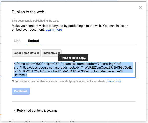
Best Way to Insert Graphs in WordPress is to Create Graphs in Google Sheets and then Insert it in Your WordPress Website.
I researched a lot and found a simple solution to the problem; a chart can be created inside the Google Sheets and then inserted into your WordPress post. Yeah, it’s pretty simple and easy to do.
Create a New Google Sheet Document
To create a new Google Sheet document, first of all, you’ll need to go to sheets.google.com and Create a new blank spreadsheet. Name your document anything you want and go to the next step.

Fill in the Chart Data
| Never Put % (Percent) in the Data Field. |
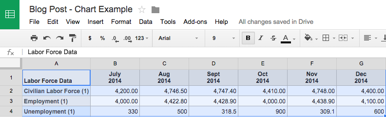
Since spreadsheet document has already been created now you need to type in the details that you want to create the chart for. There is no need for providing the column name.
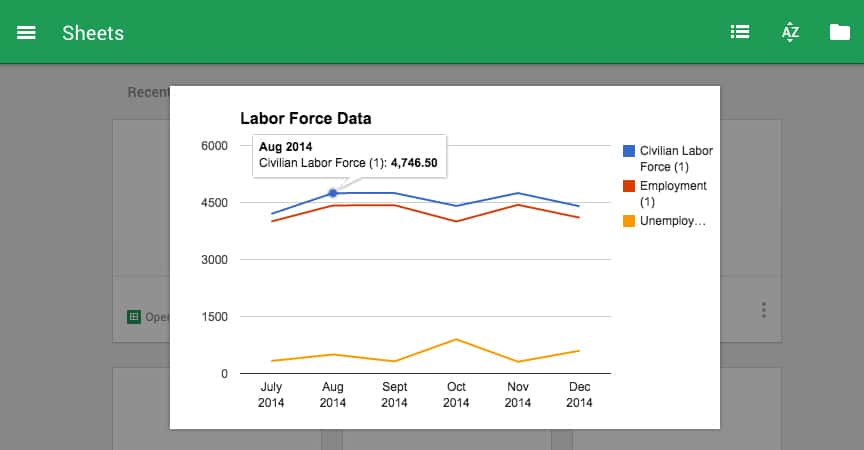
In the A1 column, you can fill in the parameters and in the B1 column, data can be filled in as shown in the image below.

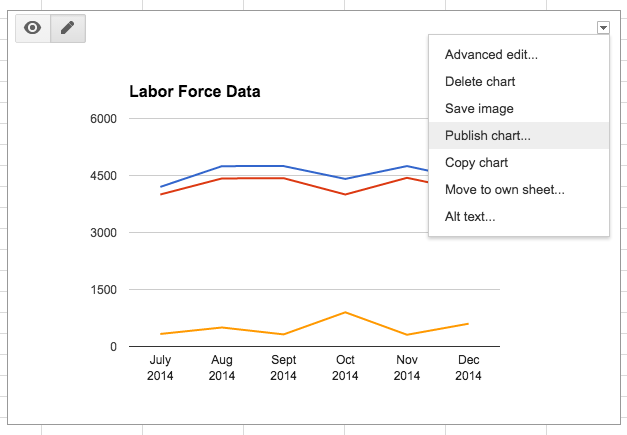
Insert the Chart
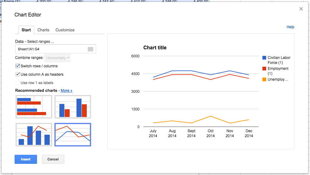
Now select the filled in data as shown in the above picture and then go to Insert tab and click on the Chart, after that, a chart will be inserted into your spreadsheet. Below pictures will show you the same.

After that Google sheets will detect and automatically insert suitable chart as per your data. You can also change the chart type by clicking on the Chart Type option which appears to be in the upper right section. There will be multiple chart type options you can choose from.

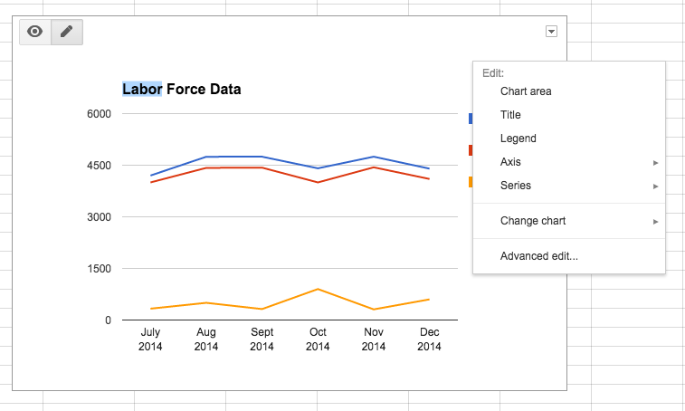
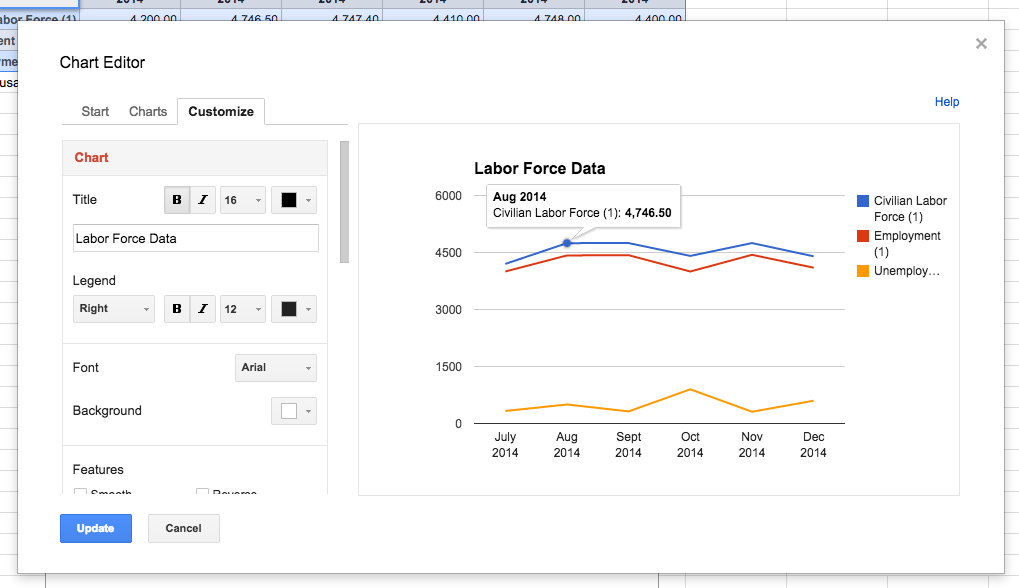
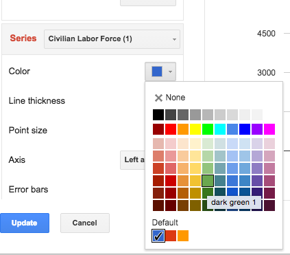
You can also customize your chart by going to Customize tab which also appears to be in the top right part of the spreadsheet. There, you can customize various aspects of the chart like; Chart style, Chart and axis titles, Series, and Legend.

Here’s a short video describing the same, take a look.
Now that your chart has been created and customized as per your requirements, here comes the next main part of the tutorial…